Muted opulence: The art (and science) of understated luxury packaging
In a category dominated by bold colours, high-shine finishes, and ever-louder brand messaging, the most compelling luxury beauty packaging is very often the quietest in the room. At Hunter Luxury, we see this shift every day – from new indie brand players to global names embracing calm, confident restraint over brash expression.
This is muted opulence: packaging that doesn’t need to shout to be heard. True luxury, after all, isn’t about grabbing attention, it’s about commanding presence. And for beauty brands, that presence is achieved through design choices that whisper quality, purpose, and care.
Over the years, we’ve crafted some of the most subtly punchy packaging designs found anywhere in the industry – from refined vanity cases to reusable beauty tools and prestige skincare kits. In doing so, we’ve honed a set of principles that continue to guide our work whenever the brief calls for quiet elegance and depth.
These aren’t rules for the sake of rules – they’re battle-tested cues that keep understated design from slipping into forgettable.
Understated luxury begins with substance. In beauty packaging, that means choosing materials that have weight, texture, and integrity. Think soft-touch uncoated papers, structured fabrics, brushed metals and subtly textured PU. These surfaces don’t need embellishment to shine – they invite touch, build connection, and suggest permanence.
We often describe our work in terms of how it feels, not just how it looks. A box that closes with a satisfying click. A vanity case that balances just right in your hand. These are sensory cues that signal care; someone designed that with consideration and thought. And these materials are especially powerful when they’re not competing with bright colours or busy graphics.
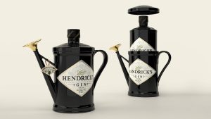
This principle is at the heart of projects like the Charlotte Tilbury Pillow Talk vanity case, where we used quilted nude-pink PU and rose gold detailing to create a piece that’s elegant, functional, and unmistakably luxurious – without needing to shout.
Muted opulence doesn’t mean colourless, it means intentional. We work with brands to develop colour palettes that offer depth and versatility: warm neutrals, soft greys, mineral tones, and the occasional flash of metallic. These shades say a lot more than PANTONE® numbers on a design brief, or spectral data, would suggest. They elevate product presentation by calming the eye and allowing the product to take its well-deserved centre stage.
More importantly, these tones have staying power. Where trend-led brights may fade fast, neutrals and softer pastels age gracefully. This makes them perfect for reusable packaging – cosmetics cases, accessories, or vanity units designed to stay in the consumer’s life far beyond the initial unboxing.
When you see a piece finished in oyster, mushroom, or soft bronze, and it still feels relevant five years on – that’s the power of thoughtful colour choices laid bare.
The real measure of beauty packaging isn’t how it looks when it’s brand new – it’s how it feels after it’s been used a hundred times. Can it become a keepsake? A daily part of someone’s routine? Something that sparks joy not just on day one, but on day one hundred.
This is where muted luxury thrives. Without gimmicks or excess, it creates space for the user to form their own connection with the product in a way that feels organic. Designing for this kind of emotional longevity means creative engineering, timeless forms, and materials that age well.
Understated design is about intention. Every component, every closure, every stitch must earn its place. That’s why muted packaging often demands more from a structural and engineering standpoint – not less.
Without decorative distraction, there’s nowhere to hide. The fit must be perfect. The mechanism flawless. The texture, alignment, and proportions must all support the brand’s identity and promise.
This is why we spend as much time perfecting the unseen mechanics of a gift set drawer or the hinge of a mirror lid as we do selecting colour swatches. Subtle luxury isn’t about skipping detail; it’s about making those details invisible to all but the most discerning eyes.
Today’s beauty consumers care about what’s behind the pack as much as what’s inside it. Sustainability isn’t a trend, it’s an expectation. But understated packaging offers a powerful way to bake those values into the product story without making them feel forced.
As a B Corp company, we believe sustainable design and luxury design are not at odds. In fact, they often share the same values: quality, longevity, and emotional value. Many of our most elegant projects are also our most impressive from a circularity standpoint. This could include use of recycled materials, low-impact finishes, or formats designed for reuse.
Muted opulence naturally lends itself to this approach. When you avoid unnecessary lamination, cut down on print embellishments, and focus on smart, structural beauty, you reduce waste and elevate the product at the same time.
Muted doesn’t mean forgettable. It means focused. Considered. Confident. And in beauty, that’s what resonates most.
As the category continues to shift and evolve, we believe the most exciting innovations in packaging won’t be the loudest – they’ll be the ones that demonstrate restraint with purpose. Brands that embrace muted opulence are building longer-lasting relationships with their consumers. They’re inviting their packaging to become part of the ritual, part of the lifestyle, part of the memory.
That’s not just packaging. That’s presence.
Our team of packaging experts works with the world’s largest brands. Drop us a line at info@hunterluxury.com, we’d love to talk through your project brief with you.
Harpenden Hall,
Southdown Road,
Harpenden,
Herts,
UK,
AL5 1TE