Part of the magic of packaging is that it can make products worth more than the sum of their parts. Collect 25 beauty products together at a low price, and you can offer consumers a great deal that they’ll appreciate. But if you take those same 25 products and put them in a bespoke, engaging packaging solution, you can capture their imaginations in a way that they’ll never forget.
This is the theory behind the NEXT beauty advent calendars released in time for the festive season every year. And it’s a theory that has now been comprehensively tested and proven, as consumers don’t just buy these products, they eagerly await their release. We had first-hand knowledge of this, having delivered 2024’s calendars, one of which doubled as a premium chest-style vanity case, alongside another case styled after a giant Christmas cracker. These were complemented by a range of mini beauty Christmas cracker trinkets, in what was a rewarding experience for our team.
When the opportunity arose for us to take an even more involved role in the development of 2025’s calendars, it was an opportunity that our team took with both hands in order to raise the standard even higher for NEXT customers.
NEXT – and its beauty advent calendars – are two high street icons that need no introduction. One of the most prominent brands to join in the advent calendar tradition, NEXT’s seasonal offerings have built something of a cult following among high street beauty shoppers, and their release is eagerly anticipated in a way that few premium products are.
After working on both an advent calendar plus a range of beauty Christmas crackers for 2024, delivering something that exceeded these already high expectations while also meeting NEXT’s corporate sustainability goals posed a technical challenge. And, as a seasonal mass market product, the packaging needed to be produced to a strict deadline and at an affordable cost.
Fortunately, our strong existing relationship with the team at NEXT meant we were able to work efficiently. As Olivia Moss, Account Manager, explains, the customer felt comfortable giving us a greater level of creative input over the project from the outset.
“We set up inspiration days where we went into NEXT Beauty and said: ‘We’d love to show you these advents we’ve designed. Do you like them? Would you like to do them?’ And they picked two of them. It turned out that they also really liked our graphic design elements,” she says. “Usually when we present a design concept, we’ll include placeholder graphics to make it look polished, but the client typically chooses the structure and then creates their own artwork. The theme and visuals are usually client-led. But with NEXT Beauty last year, it was a great opportunity where we, as Hunter, were able to both lead the structural development and play an integral role in the graphic design.”
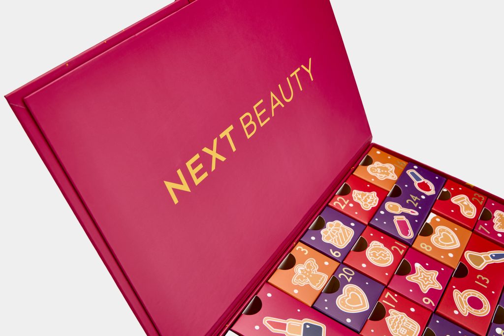
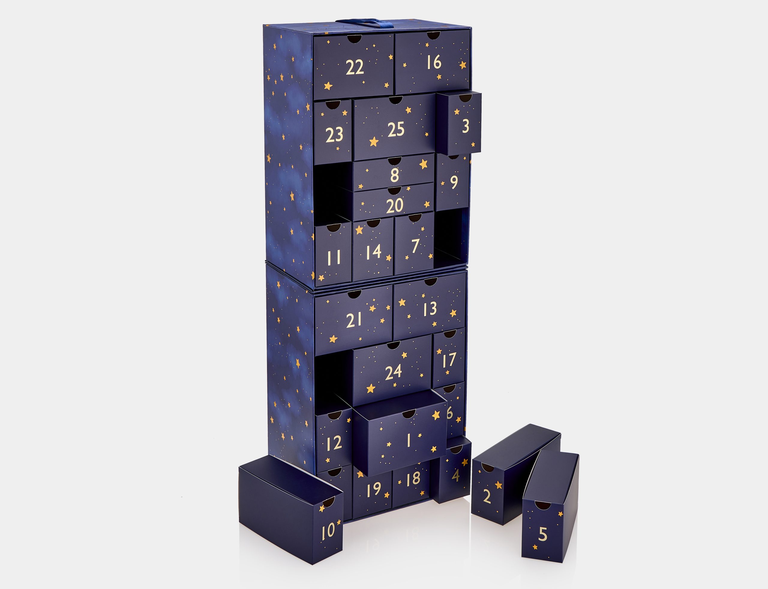
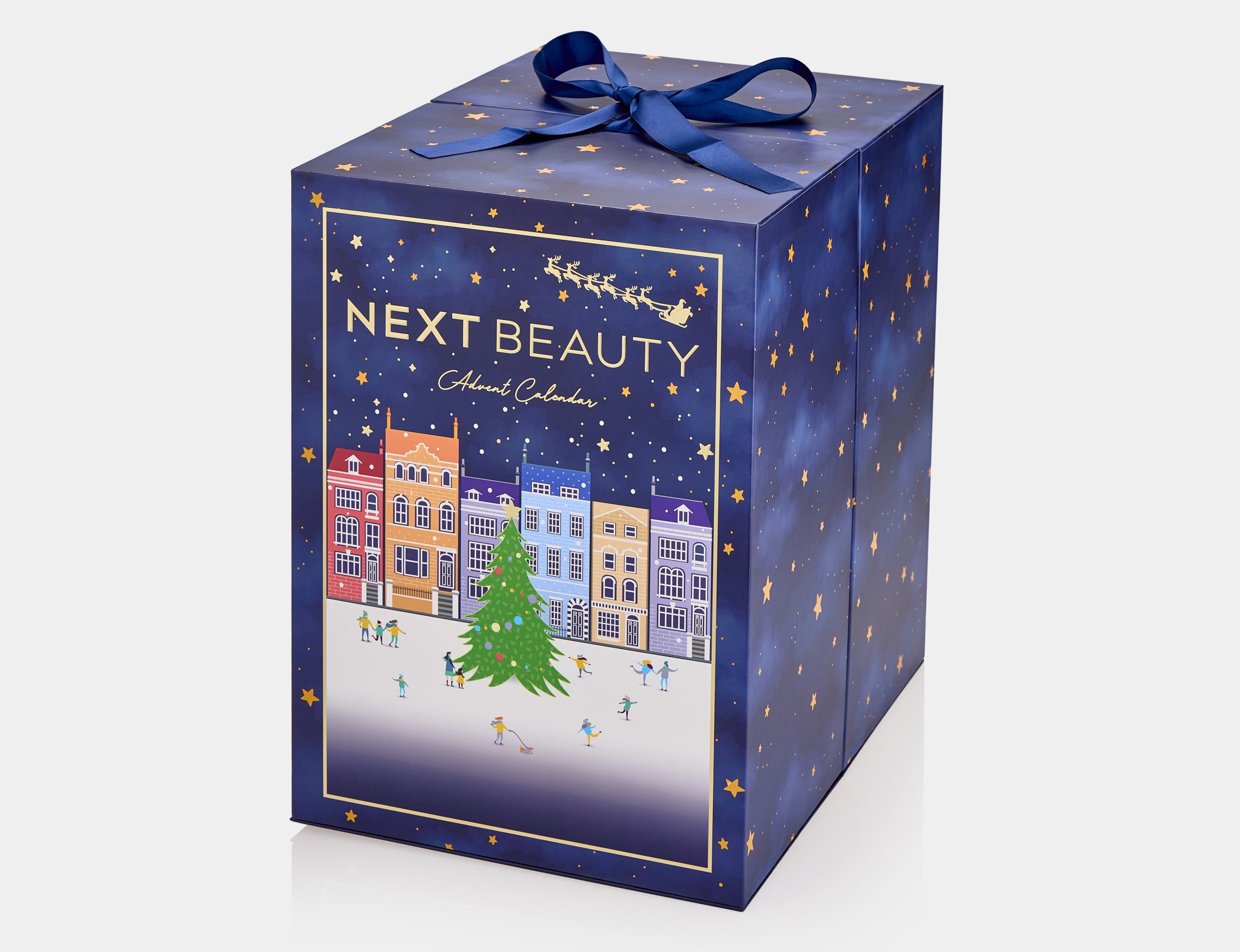
The two concepts chosen were the 25 Days of Beauty Advent – a hinged box inspired by chocolate boxes – and a snowglobe-inspired design that would eventually be refined into the final The Luxury Beauty Advent concept that ended up on-shelf.
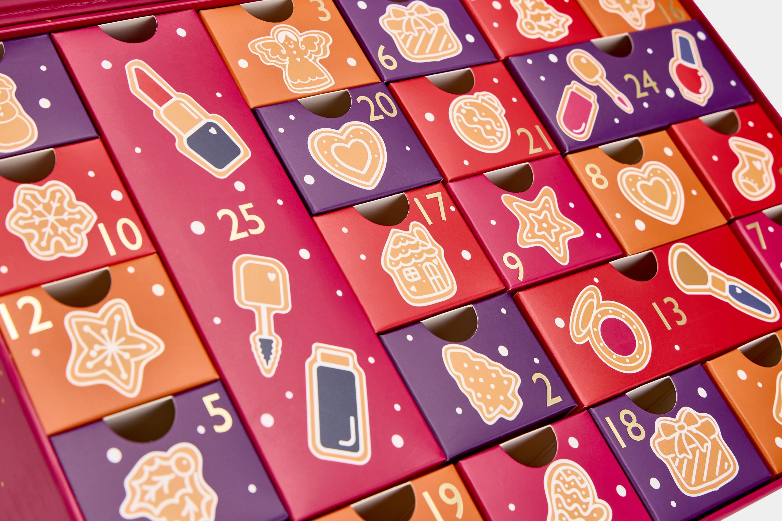
25 Days of Beauty Advent started out by leaning into the chocolate theme. Initial concepts involved opening the lid to reveal 25 mini folded cartons, each one containing the product. These cartons would be printed with a number and a small chocolate-like design, as a tribute to a traditional chocolate advent calendar. This concept evolved into a Christmas cookie theme. All 25 cartons were kept on the same level within the box, mimicking the look of a biscuit selection tray.
It carries a more minimalist look, using spot UV varnish, embossing, and foiled typography to create a festive pink and gold aesthetic that combines tradition with modernity. The entire box exterior is printed with a warm, festive pink, broken up by a pattern featuring stars of varying size and shape. Some of the stars are printed in yellow and finished with the spot UV varnish, while others are embossed in gold foil, creating visual and tactile intrigue in a relatively simple pattern.
Inside the box, the 25 mini cartons incorporated a wider colour palette ranging from deep purple through to a variety of pink and orange shades. The all-important numbers that consumers will hunt down every day throughout the festive period were picked out in gold foil alongside a colourful, printed cookie design – each one different from the remaining 24.
The strategic use of gold foil meant that the packaging is recyclable at end-of-life, although, like many Hunter Luxury designs, it is lavished with enough craftsmanship and attention to detail that consumers may want to retain it as a keepsake once the contents are gone. “We were very deliberate in keeping foil usage minimal so the boxes remain recyclable,” says Olivia.
The Luxury Beauty Advent proved to be much more complex. “It actually started as a snow globe,” explains Olivia. “It was a large format that opened in the middle with a pop-up snowflake. The Next team really loved the concept, but as conversations progressed, we decided that the pop-up element carried a risk of damage during packing and consumer usage.”
While including a delicate snowflake in the advent calendar was technically possible, designing it to be robust enough to withstand being repeatedly opened and closed once it reached the consumer – meant it was not feasible within budget.
“We pivoted,” adds Olivia. “Structurally, the client wanted the design to remain the same as our initial presentation, but the artwork had to evolve accordingly. After further ideation, the client proposed a new direction, which Hunter Luxury then developed into the finalised artwork.
“I’ve been the account manager on NEXT for two years now, so I had a strong sense of the colours, themes, and aesthetics they tend to gravitate toward. Eventually, we landed on what is now The Luxury Beauty Advent. The centre-opening structure stayed the same, but the visual design changed entirely. The snow globe concept evolved into an ice rink scene. So the journey from concept to finished product is really interesting – it adapts over time, depending on feedback, cost, logistics, and sustainability.”
In contrast to 25 Days of Beauty Advent’s pink look, The Luxury Beauty Advent leans heavily on inky blues and indigos. While it is printed with an all-over design and features yellow stars finished with spot UV varnish, the front also makes use of gold embossing to add extra visual appeal. “Only the front and back panels are foiled; the sides are left without,” Olivia says. “Some stars are foiled, and others use spot gloss to maintain visual interest while supporting recyclability.”
The Luxury Beauty Advent is noticeably bigger than 25 Days of Beauty Advent, as it is the premium-priced offering of the pair. This extra size posed a further technical challenge. “The bottom fold area was difficult to get right, especially as the final product became larger and heavier,” she continues. “With customers opening and closing it daily over 25 days, we were concerned about the fold becoming weak. So, we added an additional board piece to the base to reinforce it. It still folds the same way, but now has added durability.”
The finished products prove that NEXT was right to trust Hunter Luxury with its flagship festive beauty line. “What’s really nice about this project is how clearly it shows our partnership with the client. That’s something that sets us apart. We don’t just act as a supplier. They tell us what they want, and we make it. It’s much more collaborative,” Olivia adds. “We see ourselves as a true partner. We do annual inspiration sessions, and we’re involved in their early ideation and theming. There’s always room for our suggestions, because customers trust our input.
“That trust and collaboration are what make projects like NEXT so rewarding. They’re great examples of what it means to work in real partnership with our clients.”
For Hunter Luxury, that trust is the greatest gift of all – albeit one that is hard-earned, not given. In return, clients get their own invaluable gift – peace of mind and knowledge that their business-critical projects are in the safest of hands.
Our team of packaging experts works with the world’s largest brands. Drop us a line at info@hunterluxury.com, we’d love to talk through your project brief with you.
Harpenden Hall,
Southdown Road,
Harpenden,
Herts,
UK,
AL5 1TE