[4 min read]
Special Edition packaging is increasingly becoming a brand strategy in its own right. It is in the premium skincare brands sector where Special Edition packaging really comes to life.
In this case study we look at how Hunter and REN Skincare collaborated to deliver a Christmas gift set with unrivalled ‘gifting’ appeal.
THE BRAND
Created in 2000 by Antony Buck and Robert Calcraft, REN is known worldwide for having pioneered a new type of high performance skin care with a distinctive “free from skin-unfriendly synthetic ingredients” formulation.
THE BRIEF
True to its core brand values of performance, purity, and pleasure, REN’s skin and haircare range packaging is both simple and unfussy in its design. The iconic, minimalist labels carry plenty of white space, with a single band of colour to identify the main ingredient family, making it easy for consumers to choose their favourite products in store, and lending a classic, stylish feel to the otherwise simple packs.
During the summer of 2015 the marketing team at REN approached Hunter with the conceptual outline of their proposed 2016 Christmas gift set range. Simply, the goal was to create outstanding shelf presence and give the brand a striking Christmas feel – a vibrant, optimistic look to make the receiver of the gift feel uplifted and inspired. Something a little different than had been done in previous years.
This had to be delivered within a very clearly defined set of design requirements;
- to work with the minimalist identity of the brand rather than against it
- to talk to their exclusive, select and loyal consumer base in a new and exciting way
- to clearly communicate the ethical and clean values of its formulations.
THE SOLUTION
The teams at Hunter and REN worked together to find a Special Edition packaging solution which would highlight the lightness, clarity and ethical credentials of the brand, as well as underpin the solid backing of research and expertise that goes into every one of their formulations.
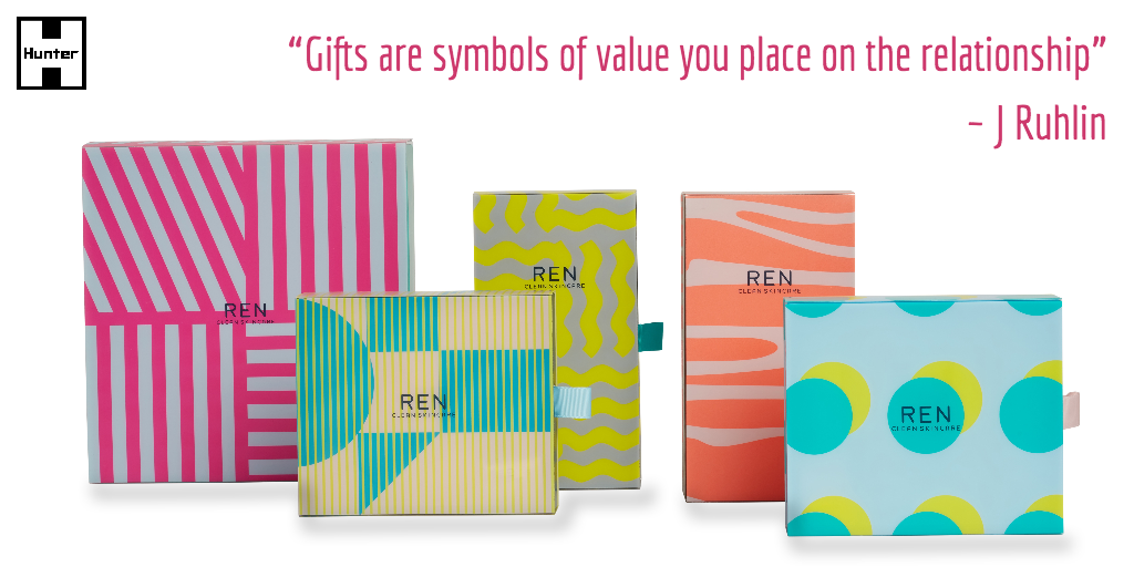
Rather than try to stand out on the shelf with unusual shapes or designs, a simply shaped packaging solution was proposed which amplified the aspirational, feel-good message of the brand in a playful way, and worked to highlight the colourful print design created by the brand’s chosen collaborator, Kangan Arora.
“Chosen as one of ’20 names to know’ by Elle Magazine, Kangan’s designs draw inspiration from vibrant Indian street culture.”
The construction of the Special Edition packaging itself was proposed as a simple drawer box, but with a clever ‘twist’. The base box of the gift set was to be formed in rigid board, carefully wrapped in smooth art-paper, and carrying a simple, single colour flood print with an inspiring and uplifting quote, finished with a beautiful ribbon pull – a classic and impeccably formed box with neatly wrapped, crisp corners.
The ‘twist’ was to add a clear, open-ended plastic sleeve to carry the vibrant design and brand logo instead of the more commonplace solid board lid. In printing onto this type of material, an intensity of colour was achieved to delight the client whilst keeping the desired lightness of look and feel.

The products were held securely inside the base box, sitting snugly in a card tray printed with a soft wash of colour, and presenting themselves proudly to their prospective purchaser on the shelf.
Further, in choosing environmentally friendly substrates throughout, Hunter was able to uphold the brand’s core ethical values.
The client was delighted with the finished products – the brand teams, in collaboration with Hunter, had achieved their goal of creating a stunning, unique and memorable Christmas gift range to stand out in the competitive retail environment, both in the UK and throughout the brand’s global distribution channels.
A real seasonal winner!
Want to know more about what we do? Have a look at our catalogue of previous projects or give us call for a chat.

