

Could we be about to reach the stage of ‘peak gin’? Just a few years ago that would have seemed an absurd question to ask. Gin was the most neglected white spirit, outshone by vodka, and the antithesis of cool. Infamously derided as Mother’s Ruin, gin was more recently shunned as an old-fashioned drink to be drowned in flat tonic by the silver-haired.
Astonishing comeback
The millennial generation with their love of small, artisanal producers and classic gin cocktails like the Martini and Negroni have changed all that. Gin was the fastest-growing super-premium spirit last year, according to drinks research company IWSR. Sales have soared by over a quarter over the past six years.
Dozens of boutique gins have appeared. They tend to offer quirky essences, locally foraged botanicals and peculiar infusions. The gin aisle of the average supermarket is now bursting with brands, and gin has become a £1.76 billion export business for the UK.
Yet the drinks world is a fickle business. Some mixologists have started complaining about the sheer number of new gins flooding the market. What is becoming clear however is that in this ultra-competitive white spirits sector, engaging and distinctive packaging is an absolute must if gin brands are to stand out from the crowd.
Choices, choices, choices
Gin bottles, labels and secondary packaging have traditionally adopted a green colour palette. The colour derived from the original dark green of Dutch genever bottles of the seventeenth century, as well the juniper bush itself, the one ingredient gin must contain to be classified as gin. The advent of Bombay Sapphire with its iconic cobalt blue bottle in the 1990s broke the mould, however.
 But with display shelves getting busier and busier, the need for distinctive, eye-catching gin packaging has only increased in importance for both mature and new brands.
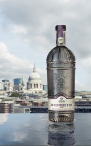
Communicating a sense of place is an important emerging trend as authentic provenance is extremely important to millennial consumers. For instance, the start-up The City of London Distillery recently unveiled Christopher Wren gin, named after the capital’s famous architect. The neck and shoulder of the gin’s striking bottle resemble the famous dome of St. Paul’s cathedral, Wren’s most famous work.
Other gins have taken a more light-hearted approach to expressing their English credentials. For example, every bottle of Broker’s gin features a stopper in the shape of a London city gent’s bowler hat.
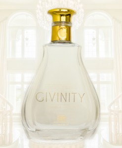
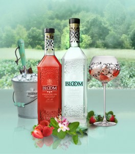
The growing popularity of gin-based cocktails amongst women is also reflected in many of the newer gins coming on to the market. For example, the new small-batch London dry gin from Cambridgeshire, Givinity, sounds and looks just like a high-end fragrance. It comes in a clear, curvy glass bottle and is stoppered with a gold-plated bottle closure. Similarly, Quintessential Brands’ super-premium Bloom gin features a feminine bottle design inspired by a classic English country garden.
Even mature gin brands such as Tanqueray, established back in 1838 and famous for its iconic green bottle, are having to take a fresh look at their packaging. A new gift pack for its super-premium line extension Tanqueray Ten, for instance, celebrates the ten citrus botanicals in the gin by making the bottom of the bottle resemble a citrus squeezer. The accompanying gift box with its intricate, Art Deco-inspired graphical elements references the roaring 1920s and the birth of the cocktail age.
At Hunter we understand that effective, striking gin packaging has to do more than just look good on the eye and complete a routine checklist of what a premium gin should look like on the back bar. Superb gin packaging has to communicate the DNA of the brand or it will simply get lost in the tide of new gins that are flooding the market.
